12 Web Design Trends for 2017
As we move toward the end of 2016, 2017 predictions for Web design trends are already appearing all over the Internet. In part, Web design trends in 2017 look to be a continuation and intensification of existing trends, but there are also many predicting reversals and corrections in certain aspects of Web design.
In general, there is no doubt that Website design styles are getting sharper and “sleeker,” and that more powerful Internet-connected devices are allowing websites to run faster even while utilizing the high-resolution videos, animations, parallax view, fully mobile-friendly formatting, and all the other latest website trends.
Here Are 12 of the Most Commonly Predicted Specific Website Trends for 2017:
1. Customized Images

In the past, many websites relied heavily on “stock photography,” and many still do. But this is changing rapidly. Today’s Web users are comfortable seeing such stock photos on social media sites and amid blog pages, but they expect something more unique and of a higher caliber on a branded website. They want to see a picture that “says a thousand words” but not the same thousand words they’ve already heard at 10 other websites.
2. Videos and Animations

It seems the Internet grows more and more similar to TV with every passing year. It will never quite get there since text must always make up a substantial portion of most websites — but already, images of some sort account for 50% of Web content. Background videos are now becoming a popular alternative to static backgrounds, and animated images are more and more taking the place of their static counterparts.
3. Parallax Scrolling
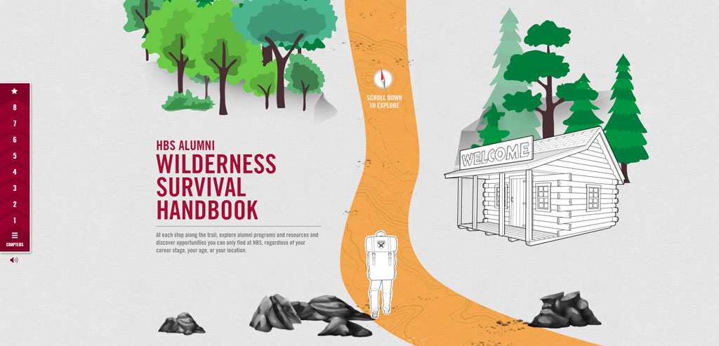
Credits to: webby awwards and hbs alumni – wilderness survival handbook
“Parallax” allows the fore- and back- grounds to scroll at their own speeds, which creates a sense of “depth” for the user, and combined with upcoming split screen layouts, the user experience is set to be more dynamic than ever. There are still some challenges with implementing parallax in full, such as slow load times, negative SEO impact, and difficulty making parallax function well on mobile. But these “bugs” are being worked out, and many see parallax as the wave of the future.
4. A “Mobile First” Policy
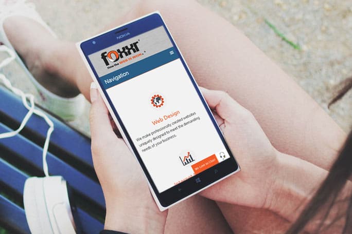
Up till now, Web design trends toward mobile integration always began with desktop in mind and then “added mobile on” afterwards. Now, many see that trend reversing. With over a billion mobile Web users worldwide and 1/4 of U.S.-based mobile users using nothing but mobile, Web design must inevitably move in their direction.
5. The Demise of “Splash Pages”

Credit to https://60th. Eurovision. Tv/
Many websites, though certainly not most, still use a “splash page” as a kind of interim welcome page that stops you and forces you to click to continue before you can reach the actual website. These pages receive high bounce rates and can even lead to an error message if flash animation is included in the splash page but the visitor lacks flash capability. Additionally, many find these pages “annoying and unnecessary” to begin with, so they seem to be on their way out in 2017.
6. Back to Multi-Page Dominance
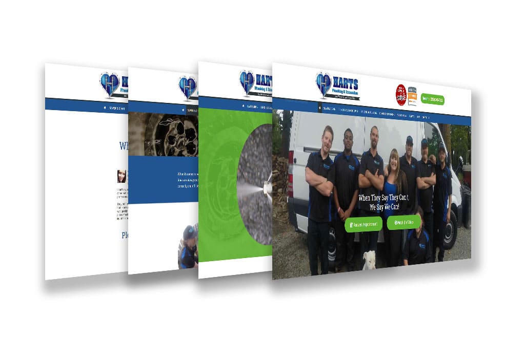
Not too long ago, websites began to trend toward single-page, with simplicity and unity being the calling cards. As we go into 2017, however, multi-page sites are gaining once again. Perhaps, users felt that one page was simply not enough to explore and keep them coming back again, but SEO issues are a major reason for the reversal as well, since multi-page tends to do better in organic search results.
7. “Iconic” Navigation
Credit to: dribbble. Com dashboard shot
This may not become the norm by the end of 2017, but we think it will at least make some progress. Some websites are already replacing their navigation texts with icons. This saves space and is easier once you know what the icon means. As long as the icon is “intuitive” or easily learned, this trend can be successfully implemented.
8. “Flatter” Websites
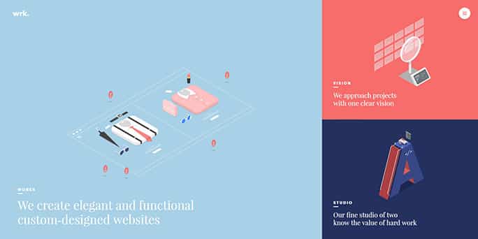
Credit to waaark. Com
This is a continuation of an existing trend. Along side the increased use of video and animations, there is a shift toward simplicity of design with plenty of “white space.” We expect this minimalism to continue to grow and be integrated with other Web design trends in creative ways.
9. Responsive Design
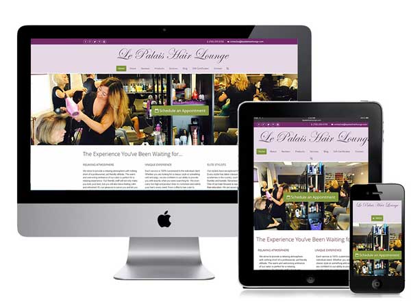
Here is a rather new trend that few probably saw coming: websites that adapt themselves automatically. And this adaptation is not merely to different devices, as in mobile/non-mobile, but to different age groups. Menus, fonts, colors, and more will change as triggered by age and proficiency level, provided that information is provided to the website.
10. Storytelling
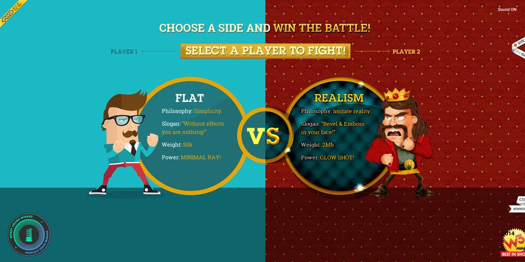
Credit to flatvsrealism. Com
In the past, the “About Us” page was about the only resource for learning the story of the company behind the website. Now, however, a new “storytelling” trend is taking hold, which will both show and tell the user the company story via a combination of text, photos, videos, and animations. In some cases, the story will “continue” only as the user clicks or scrolls as needed, thus creating interactions and leading the user “deeper” into the website.
11. Micro-Interactions Go Mini
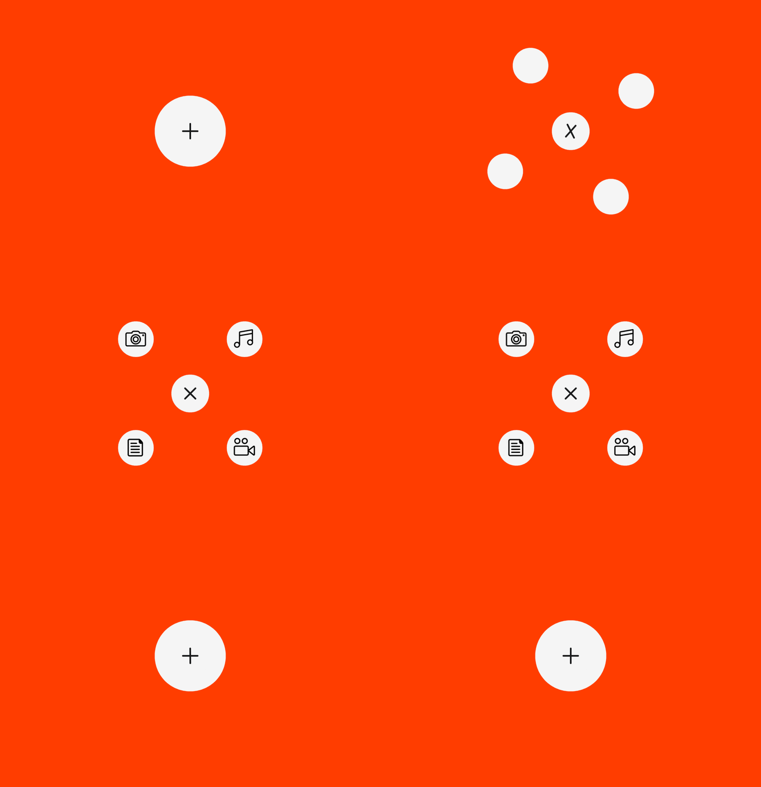
A couple of years ago, we may have thought that micro-interactions, like setting up a password or making a subscription, were small enough. But now, “micro-mini-interactions” are the latest trend. This breaks down the actions through which users interact with a website even further and is becoming the new way to measure website interactivity level.
12. Tactile Interactivity
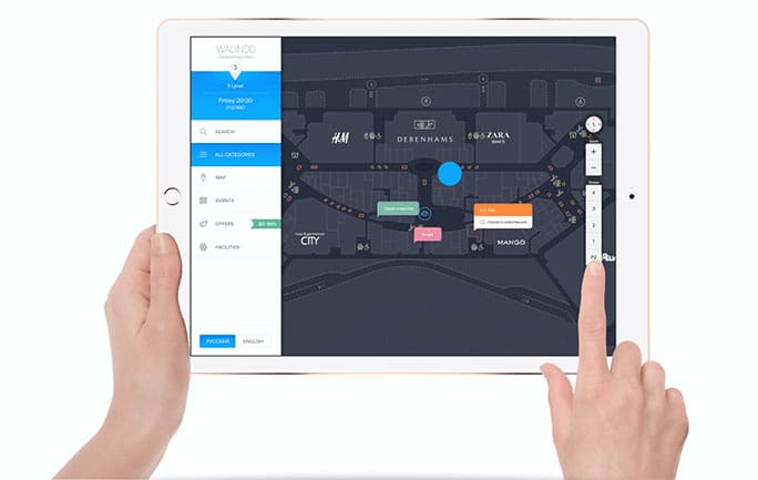
What is being dubbed “haptic feedback” is, perhaps, the most interesting of the latest Web design trends for 2017. “Haptic” technologies use a keyboard or other feedback device to send tactile cues to Web users. For example, pulsations and vibrations can be triggered when potential buyers are hovering over a product page or an online checkout line but not making the next move. Of course, these “cues” need to be “polite” and even subtle at points to avoid offending Web users, but the basic idea of touch signals being involved at all is certainly novel. It will be worth watching to see how far haptic feedback gets in 2017.
Conclusion
Keeping up with all of the latest Web design trends in order to stay ahead of your competition is only “smart business” for owners of eCommerce sites. The sites that give their users the most of what they are looking for in a website will better generate and retain new customers.
But to stay on the cutting edge of the latest developments in “Web tech” you will almost certainly need to rely on skilled, professional Web designers who can discern which Web design trends are most likely to last and be cost-effective, and implement them efficiently.
To learn more or to arrange to have your website upgraded to include the most advanced Web design trends, contact Foxxr today for your St. Petersburg Web Design needs or call us at 727-379-2207.
Get Found, Get Ranked, Get More Customers
[frmmodal type=”formidable” id=12 label=”Get a Quote” class=”fl-button request-demo”]
