Check Out These 12 Web Design Trends Happening in 2022!
Each year, a new wave of web design or web development trends inspires designers to create interactive, engaging site user interfaces to immerse their visitors and keep them coming back for more.
Design trends shape everything from how web designers form their designs to how future versions of websites, landing pages, digital marketing methods, and internet platforms are developed. They also tend to change at a rapid rate. This makes it crucial to stay ahead of the game when it comes to the latest web design trends and how you can incorporate them optimally into your own designs.
Keeping your web design elements on-trend will ensure that your designs meet the expectations of your target audiences, attract as much traffic as possible, and remain relevant in the face of the ever-evolving digital world.
Without further ado, let’s explore the 12 most noteworthy web design trends of 2022 to provide you with website design inspiration and web design best practices!
1. Mega Navigations and Footers
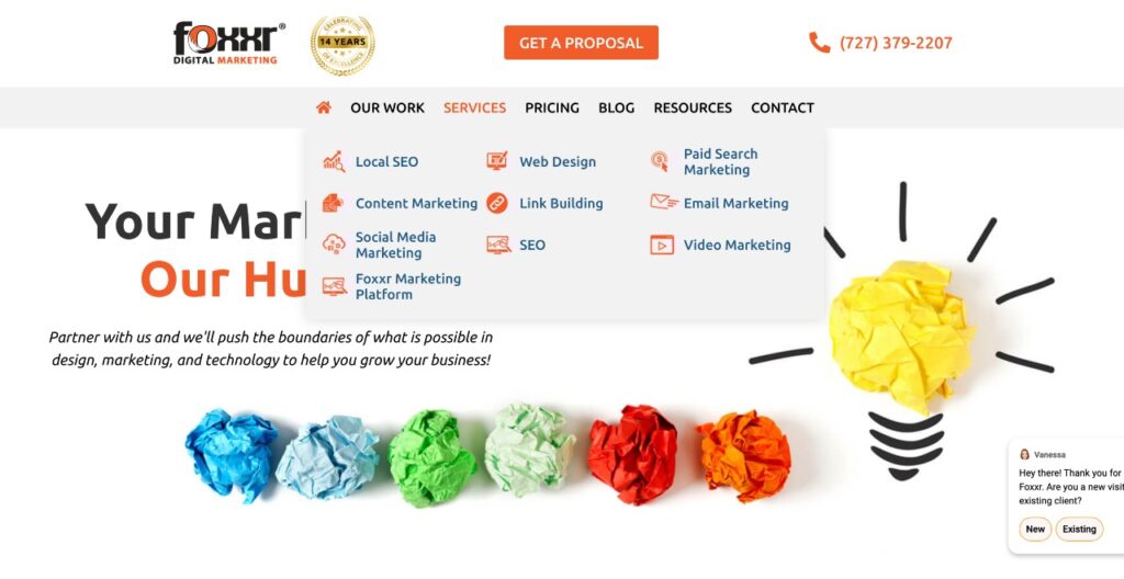
Mega navigations and full-screen dropdown menus are becoming increasingly popular in 2022. The most popular mega navigation design model is the column construction model. This model enables you to allocate categories for hyperlinks and lists deeper hyperlinks without too many fly-out menus, which can overwhelm website users. Mega navigation dropdowns can take up an entire web page, allowing you to create at least three to four columns in a single dropdown menu.
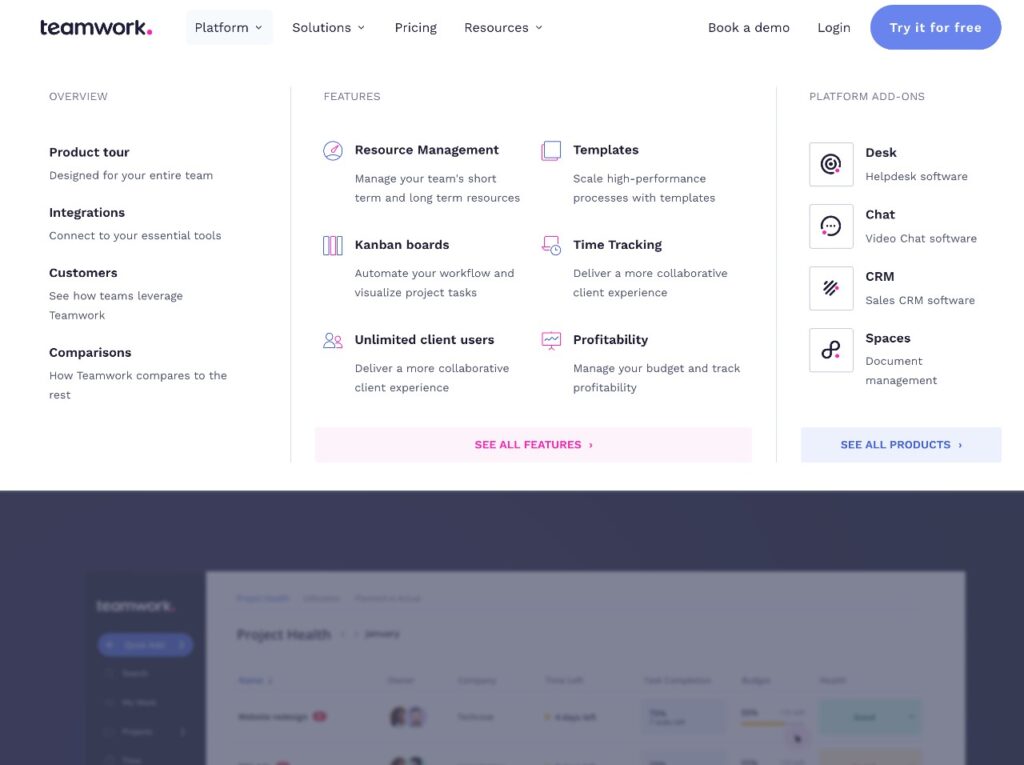
As a designer, you can use various methods to create distinct dropdown menus using mega navigation. Some web designers create hyperlinks for different categories or departments, allowing users to browse by category, class, and subcategory.
For instance, a home and furniture eCommerce store could have a mega navigation menu that allows customers to search for Furniture > Bedroom Furniture > Bedside Tables in a single menu. This layout makes it infinitely easier for customers to shop through specific selections and hyperlinks without using the search tab to find what they’re looking for.

The mega footer trend takes a similar approach to website footer design. Using this model allows you to list multiple categories and links that would clutter the top of a page at the bottom of it instead, giving users access to all the information they need while still keeping the site design neat and intuitive.
Mega footers work for several reasons.
- Web users spend much less time looking at the top of websites than expected, so you only have a few seconds to grab their attention when they land on a page. There may be plenty of important information that you need to add to the site. But having it at the top of the page may not be the optimal positioning for it. Your top navigation links should ideally focus on your standout graphic and call to action. Restricting all other information and links to your footer may help your website to create a robust first impression among new visitors.
- Divisions and locations, maps for physical locations, search bars, and legal data like terms and conditions pages and privacy policies are popular additions to footers. They have become something of the norm now. But mega footers can contain links like your website’s categories, secondary pages like Contact Us and About Us, and links to FAQ pages.
- Mega footers are also ideal for displaying links to payment method pages, shipping and returns information, business contact details, and lists of franchises. Many sites also opt to include their social media links, sign-up forms for new clients and customers, and business contact details in the footer. Plus, this is an ideal spot to include a smaller version of the site’s logo and tagline to create a more cohesive brand experience without taking up too much prime top navigation space.
2. Dark Theme, Behavioral Design, and App-Like Experience
Numerous web design elements and trends are surfacing in 2022 that may help keep your designs looking professional, modern, and aligned with the latest web design best practices. The dark mode is a particular favorite among web users, along with visual and functional playfulness and behavioral design.
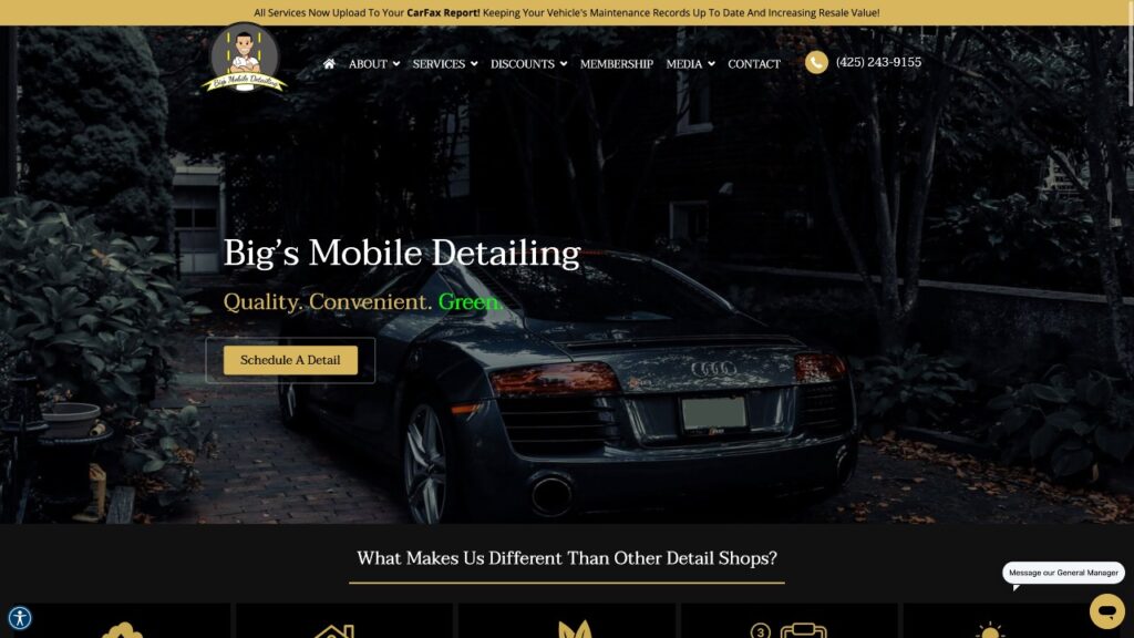
The behavioral design focuses on using visual cues to shape and influence the behaviors of web users. This design trend pairs creative design elements with scientific data to enable designers to understand how users think and, more efficiently, influence their on-site actions.
In the context of app development, the behavioral design enables users to reach certain goals, maintain regular habits, and develop new skills. This web design process uses techniques like scarcity and the CAR model (Cues, Action, Reward) to provide cues, encourage specific actions, and reward certain user behaviors.
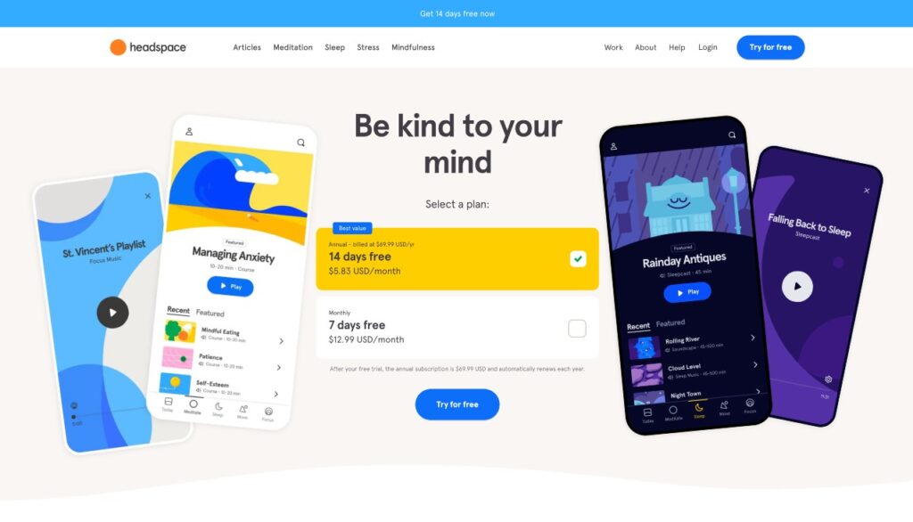
One great example of behavioral design is Headspace, the world-renowned meditation app. The platform owes its success in part to its ability to keep its customers active by using behavioral design, personalized playlists, history statistics, and synced schedules to keep them meditating every day.
This combination of design elements is informed by extensive data on user behavior and has been designed specifically to optimize engagement rates and keep users active daily. Web designers can use artificial intelligence, target audience data, and web design best practices to achieve similar results.
Designers should also focus on creating app-like experiences for their site users this year. Small, experience-focused sites may be the future of modern web design, specifically if they are front-end driven and extravagant from a design point of view. One good example is the whiteboard tool by Miro and the design tools by Canva and Wepik.

Internet users have become accustomed to using apps in which animation, interaction, and dynamic user experiences are commonplace. Bringing the same features to websites can elevate the user experience while helping to keep visitors engaged. Designers can easily use site-building tools like no-code platforms to make engaging designs focused on interaction and immersion-another of this year’s leading web design or web development movements.
3. Bold & Experimental Typography
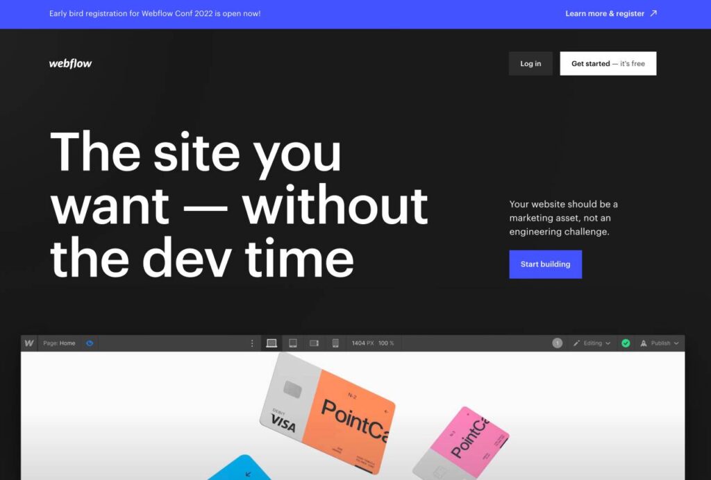
Today’s internet users rarely read entire web pages and are far more likely to scan a page for key information than sit and concentrate on vast amounts of text. The key to becoming a web design hero is to make your web designs as easy as possible for your visitors to scan, identify the most important content, and act on specific calls to action that are as visible as you can make them.

In 2022, thousands of designers have gravitated towards using bold, oversized typography in their designs to achieve these goals.
Use strong, chunky fonts for headlines, calls to action, summaries, and other must-read content to grab your users’ eyes and steer them towards the most important takeaways on a page. Using vivid, contrasting colors can also strengthen your pages’ visual effects and direct your audience’s attention.

While we’re on the topic of CTAs, your calls to action should be as familiar as possible to encourage action from your users. Consider how people navigate your site. Even if you create a specific flow, not every visitor will land on a certain page and convert to a customer immediately. They may wish to browse for a while before deciding to invest in the products or services on offer.
It’s important to keep your call-to-action messages consistent across your entire site design. For instance, if your home page has a ‘Buy now‘, or ‘Try Now for Free‘ CTA, this should be reflected on every other page containing a CTA. Don’t change things up by using similar terms like ‘Check out now‘ or ‘Buy it today‘. This does not provide the reinforcement you need to compel your site users to take action.
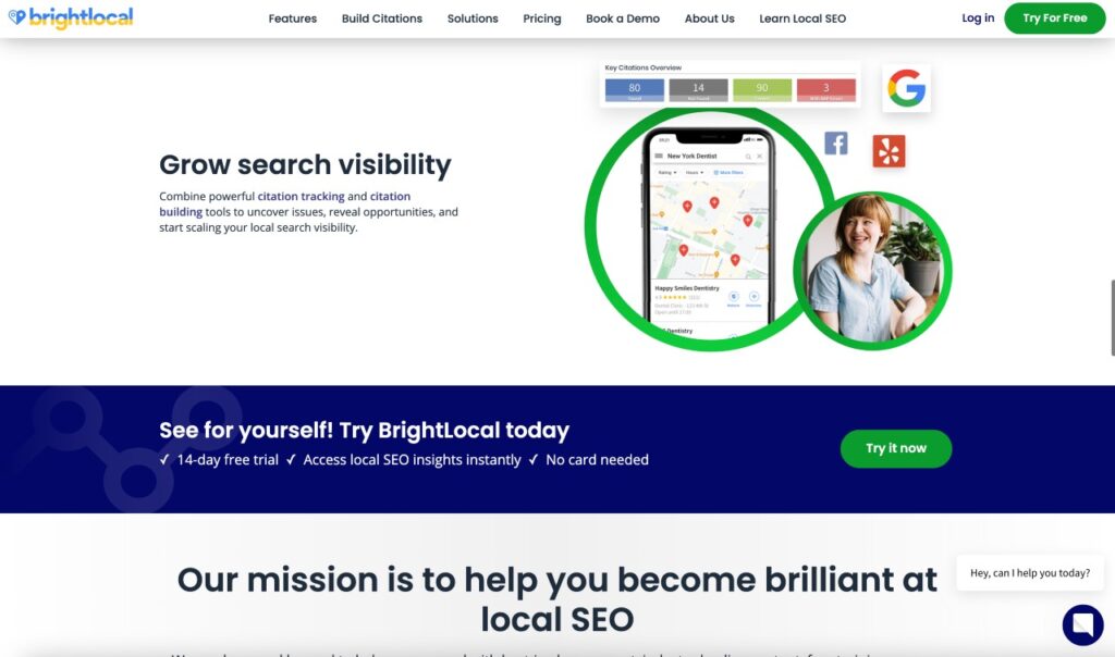
When you keep your style and messaging consistent, your users will automatically seek out the ‘Buy now‘ button if they decide to take action. Consistent use of typography, messaging, language, and design elements will reinforce your brand’s identity and help create a lasting positive impression on your users.
It may be helpful to keep your CTAs in separate paragraphs from the rest of your content to ensure that they stand out and catch your users’ attention.
4. Personalized Illustrations and Abstract Design
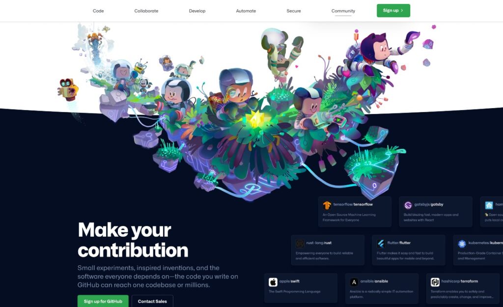
Illustrated, personalized illustrations have the power to command attention, catch users’ eyes, and add a unique visual character to your website designs.
This year, abstract illustrations are making a comeback. They have a more organic appearance and create a sense of human design that facilitates a connection between visitors and brands. The clean, geometric vector graphics and quirky illustrations that have ruled the realm of web design for the past few years are still popular among users. But many now expect illustrations that feel more sophisticated, refined, and natural.
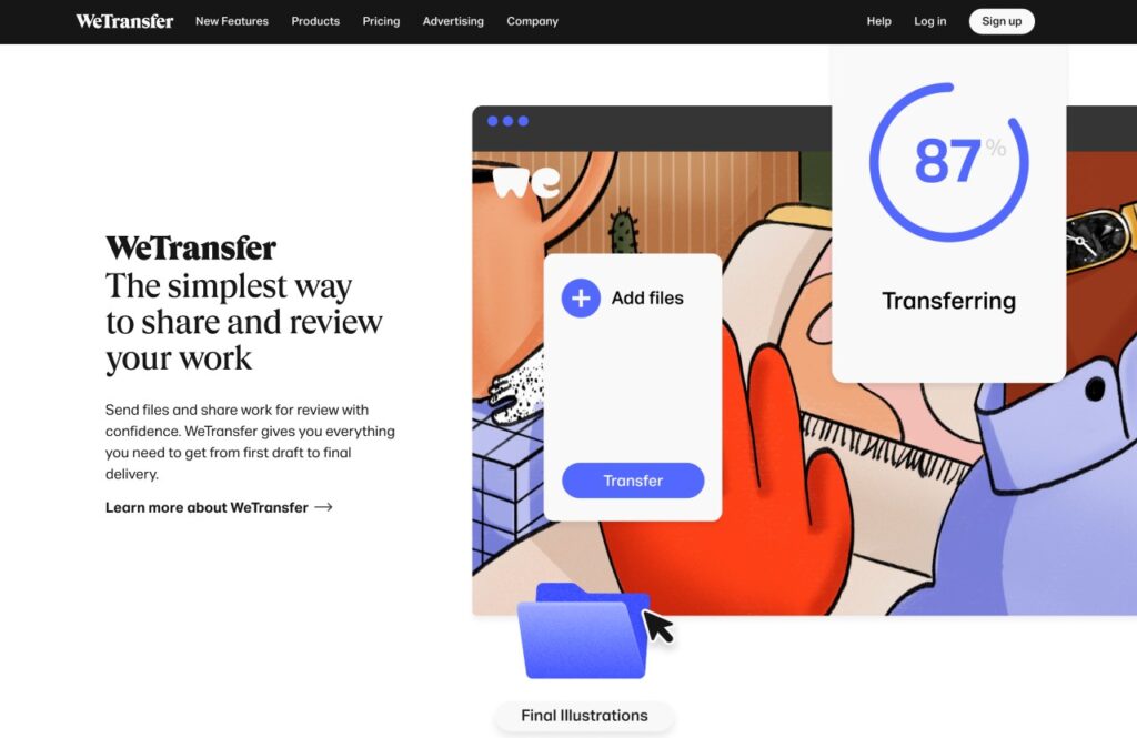
Adding illustrated web design elements to your work can be achieved in a variety of ways.
You could, for instance, use hand-drawn illustrations on paper and ink, which can be scanned and fine-tuned with illustration software before being uploaded to your site, or use digital graphics to achieve a similar effect.
Either way, the key to success is to incorporate a range of textures and organic-looking irregularities in ink, paint, watercolor, paper, and silk screen effects to soften lines and create the appearance of hand-drawn graphics.
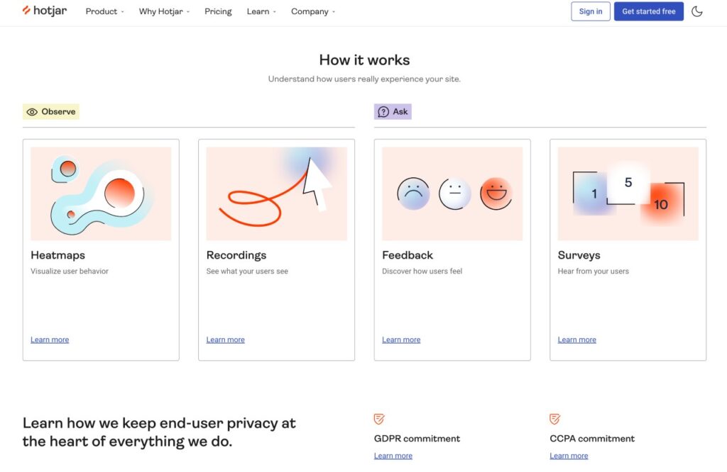
While abstract illustrations are often simple in nature, your graphics of choice don’t have to be basic to captivate your users. Intricate visual elements with unique complexities, graphic shapes, and weaving lines can allude to certain concepts and actions without directly representing any specific people or objects.
5. Aesthetic Designs
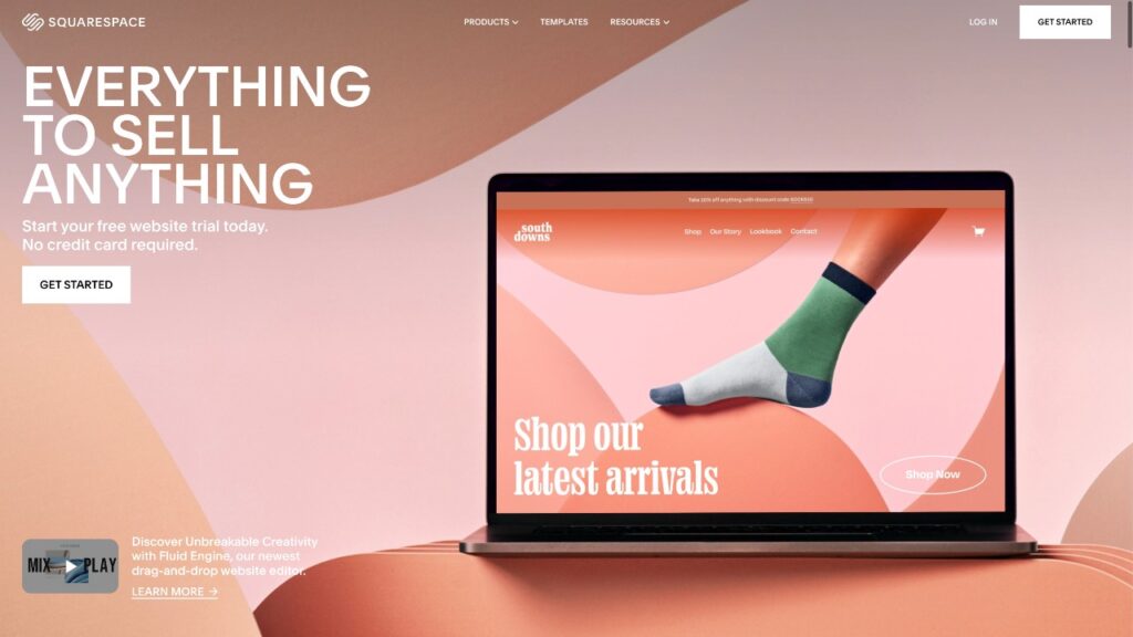
Your web design color palette of choice can considerably influence your design’s aesthetic factor. Gradient designs are especially popular among users. Adding eye-catching textures and grains allows you to create a completely different effect that feels sleek, modern, and natural.
Fine, multi-colored grains can appear similar to analog film. In contrast, larger, monochromatic grain gradients can give the impression of silk-screened posters or print mediums, adding a whole new dimension to your design.
You can use gradients, grains, and bold color combinations selectively or across your entire site design, within certain objects, or as a background to add visual interest and stay in line with 2022’s top web design trends.
Your color choices for your website’s design may be more important than you would think. Most visitors will judge your site in 90 seconds or less, and the first aspect they will see is the color scheme you have chosen. In 2022, color has become an essential way to convey brand identities and messages. So, check out your site logo and draw web design inspiration from the brand’s existing colors to ensure they align with the rest of the site.
Design choices that match your site’s logo and brand image will reinforce the colors and visuals consumers already associate with the brand in question. Consistency leaves little room for confusion and creates a familiar and predictable user experience for which people will want to return.
The linework is another aesthetic web design trend worth paying attention to this year. It can convey both modern and retro feelings while delineating headers, sections, product galleries, and paragraphs, creating dynamic web page grids, and adding visual character in the form of linework illustrations.
Get creative with combinations of ultra-fine line visuals and chunkier, more organic linework to pay homage to minimalism while keeping your site design fresh and unexpected.
6. Responsive and Rapid-Loading Pages
Every web design business knows that the key to securing lasting user engagement is to keep web pages loading as rapidly and efficiently as possible. The average internet user today has an attention span of just 8.25 seconds. 53% of users will click away if a site takes more than 3 seconds to load. Most web users expect a website to load in just 2 seconds.

Your web design UX choices can have a significant impact on the loading times of your pages. Every time you add an element to your site, your loading times and HTTP request times may get affected. This is particularly true for elements like images, videos, and other more complex media files.
You can address this issue proactively. Optimize your site’s loading times in line with web design best practices by:
- Reducing image file sizes
- Using browser caching tools to your advantage
- Improving your time to first byte (TTFB) rates,
- Combining files where possible
- Reducing HTTP requests
There are many plugins available to help speed up your site’s loading times. WordPress professionals can use tools like NitroPack or WP Rocket plugin to minify and combine files.
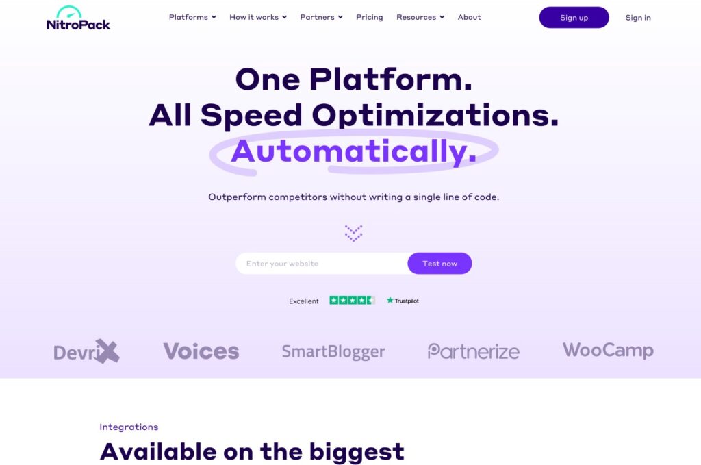
Alternatively, if your site includes downloadable PDFs, you can combine these files to reduce their size and enhance the user experience. Once you’ve updated the design of your site or added new elements, you can use Google’s Page Speed Insights tool to monitor loading times and see if you’ve made a difference.
7. Better and Simpler User Experiences
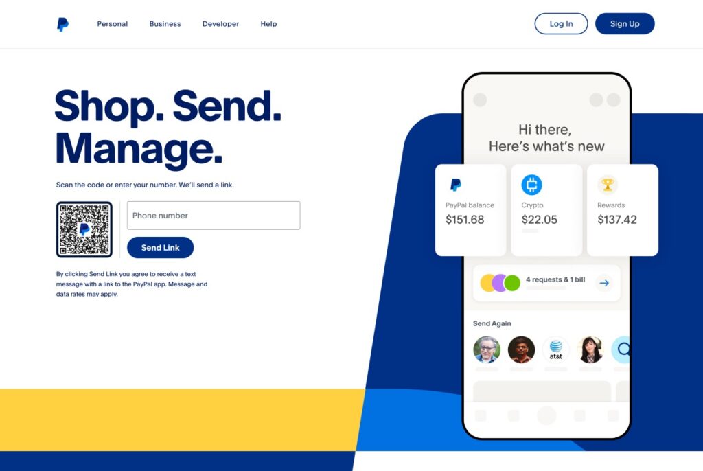
Creating a seamless web design experience for your users is crucial for keeping your traffic rates as high as possible. Your designs should be informed by a desire to optimize the user experience on offer and create pages that align with your target users’ specific needs and expectations.
Put yourself in the shoes of your website users.
Why are you visiting the site?
What do you hope to accomplish?
Where would you seek out the information you want to find?
If your visitors can’t figure out exactly where to find the right information within a few seconds, many will click away without exploring your site further.
This is why sites focusing on simple navigation and an optimal user experience are on trend in 2022. There is a vast sea of competition online, and your users have little reason to struggle with frustrating or confusing navigation.
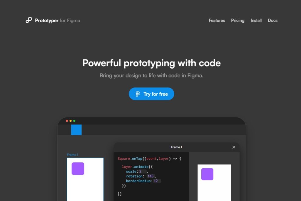
It’s recommended that you stick with tried and tested formats and keep your navigation designs simple.
Horizontal navigation menus at the top of web pages are still popular among users. This is where they will look for the menu first. Keep the options on this menu simple, easy to understand, and logical to navigate.
Limiting the choices available to your users may improve your conversions and encourage them to explore every corner of your site rather than clicking away to find a more user-friendly website elsewhere.
Remove unnecessary or redundant menu options and keep things intuitive. For instance, instead of having a dedicated ‘Home’ button, allow your users to click on the website’s logo to navigate back to the home page.
Your web designs should also be optimized for mobile use, as this is how most internet users access sites. If your designs aren’t mobile-ready, you run the risk of alienating this wide user base. Plus, you’ll prevent your users from accessing the full range of functions and design elements via smartphone and tablet browsers.
According to Google, 87% of smartphone users use their phones to perform internet searches at least once daily. And, a hefty 58% of all Google searches are conducted using mobile devices. Moreover, 70% of Google’s first page result websites are optimized for mobile devices!
Mobile-friendly designs are the key to improving your rankings on search engine results pages and ensuring that your target audiences see your sites and brands as often as possible when searching for similar websites online.
8. Split-Screen Website Pages
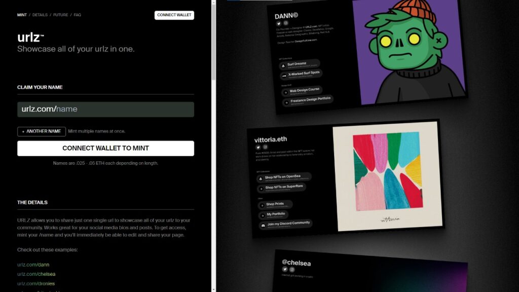
Split-screen web design examples have become a popular way to break up a design aesthetically appealing. This dual layout design adds contrast to your work, creates unique visual interest, and separates content in a natural way that your users will find easy to navigate. It also provides you with a great opportunity to add more color to your designs.
It’s possible to take this trend a step further.
You can create a more unexpected experience for users by adding a contrasting scroll action on a page’s left and right (or top and bottom) sections. The split-screen design anchors users, enabling you to add plenty of movement to your site design without confusing or overwhelming them.
9. Glassmorphism

Glassmorphism is another of 2022’s most iconic web design trends. It combines blur, movement, and transparency to create the visual illusion of glass in certain elements of your pages.
You can use this technique on illustrations, logos, headings, and subheadings. Or even in complete sections of your site to add a truly unique and memorable visual appeal to your designs.
This trend pairs reflection, shadows, and diffusion to create the optical illusion of glass. Complete with subtle movements that can make a site design appear three-dimensional without becoming cluttered or messy.
10. Dynamic Content Building
Dynamic content enables web designers to build faster, more responsive, and more complex website designs without increasing the amount of work required to make necessary adjustments.
The growing number of no-code platforms and database tools available, such as WordPress and Webflow, means that more designers can build using dynamic content, regardless of their levels of experience. This method is a far more efficient way of building for the web. Plus, it allows you to easily use all the key trends and elements for 2022 in your designs.

Dynamic content is usually built around a database linked to repeat structures. These structures can be changed in specific places, enabling you, for instance, to simultaneously change the design and layout of your blog posts without having to manually adjust them individually. One good example in WordPress is the use of Beaver Themer for dynamic headers and footers, and Beaver Builder’s field connections.

Static content still has its place. But building with dynamic content is rapidly becoming the most popular way to design and build web pages today.
11. Fewer Images in Website’s Hero Sections

Many design or development professionals choose to create web design hero sections and landing pages that communicate with design instead of static images or illustrations. Hero images create an immediately impactful visual effect while reducing the distracting effects of images on content and style.
Modern designers gravitate more and more towards using color, shape, layout, and typography to communicate unique and robust brand identities.
Avoiding the use of images in web design hero sections also creates a mysterious ambiance, inviting users to find out what else is hidden beyond the site’s hero sections.
12. One-Pager Websites
Sometimes, the most effective website designs are the simplest, least complicated ones.
The one-page website is quickly gaining popularity thanks to its easy, fuss-free navigation and bold visual statement. Modern one-page websites forgo menus and complex navigation in favor of a simple scroll design that allows users to find all the information, links, and calls to action they need on a single page.
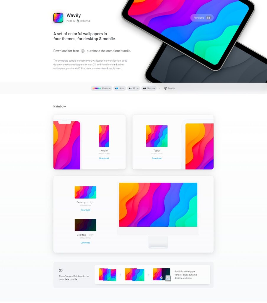
One-pagers are most effective when their topics and subject matter are narrow and specific. Some strong examples would be presentations, online portfolios for creatives, and brands that sell single products or services.
This site design has the power to replicate the feeling of reading a poster or a flyer. All the content the target audience needs to review is in a single place, is uncomplicated in nature, and unhindered by distracting navigation mechanisms or multiple page layouts.
As we mentioned earlier on, most internet users will not read a website’s complete range of content. But if you create a single-page website, you will improve their chances of reading as much on-site content as possible by eliminating the need for site navigation.
Wrapping Up
In short, staying on top of the latest trends is an excellent way to ensure more users find your site and spend time browsing it.
Implementing some or all these tips will give your website a fresh, current look and feel and attract the attention that your brand or business deserves.
Staying on trend may take some work, but it’s worth it!
